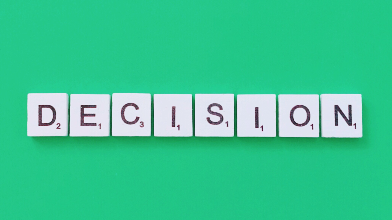
UX is just removing decision fatigue, right?
Simplifying decisions is a hallmark of great UX, but is that all UX is about?

"You don’t need better UX. You need fewer decisions"
This line from Felix Haas stopped me in my tracks yesterday and I haven’t stopped thinking about it since.
He goes on to say that great UX is about reducing decisions, and that “if your product still feels like work, it’s not a UX problem. It’s a decision problem.”
And honestly? He’s right.
Decision fatigue is the real friction
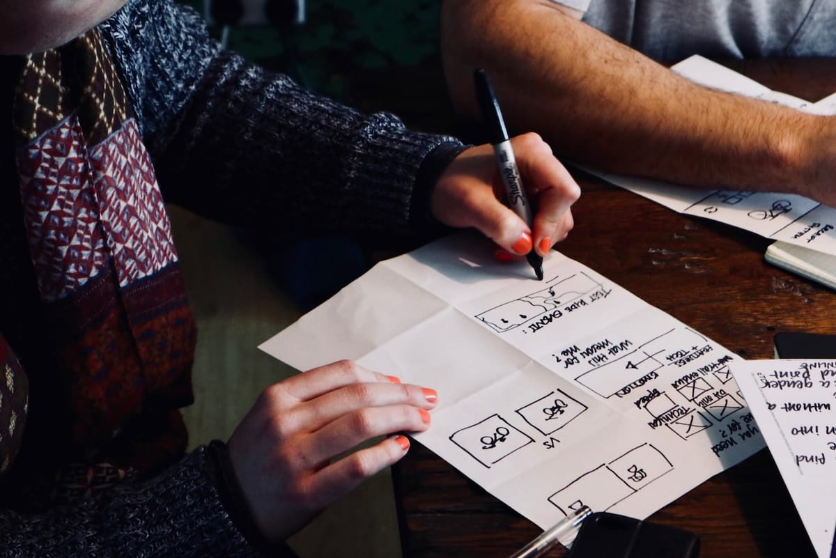
Simplifying decisions is a hallmark of great UX. Think of the “golden path” — or as Audrey Hacq defines it, the Key User Journey: the focused route users take to reach the real value in your product. That’s what we should be optimising.
On the flip side, you’ve got edge cases. These are the weird, awkward, sometimes painful scenarios that don’t happen often — but when they do, they matter. Startups often discover them via bug reports, confused users, or in the worst case, churn. More mature teams anticipate them and design with grace and empathy.
This isn’t a new idea. In a piece by MIE Coach, they write:
Decluttering our decision-making time and reducing the number of micro decisions we must make helps in reducing the risk of falling into the decision fatigue loop. When our reserves run low, even simple tasks start to feel overwhelming and out best thinking can slip away.
They’re right too. When we’re overloaded with choices - even small ones - our brains get tired. And tired brains don’t convert.
Quick side note: some of the best restaurants I’ve ever eaten at had no menu. Just one option — steak and frites at Le Relais De Venise. It’s oddly liberating. You sit down, you get great food, no decisions. The experience wins.
UX is changing - so is how we build
I think we’re at a turning point. UX isn’t dead, but it’s shifting — fast.
You can’t just run another discovery workshop and call it a day. You need a new system.
I’ve been building one behind the scenes. I’ll share more soon, but it’s based on real clarity from the start — not just for the user, but for the team building it.
Here’s how I work now:
- Start with a clear brief. Whether it’s a growth experiment, PRD, or pitch deck, we define what we’re aiming for.
- Scope what’s worth building. That could mean slicing an MVP or mapping sprint tasks.
- Prompt instead of prototype. If I’m “vibe coding” (usually in Lovable — [read my thoughts on that here]), I’m using prompts to build full UI stacks. React, Tailwind, Shadcn — no Figma. Just shipping.
Even the designer’s role has changed. In some ways, we’re removing their decision fatigue too.
So no, UX isn’t dying, but the way we design for it, the way we build around it, and the tools we use to support it - that’s all evolving. Rapidly.
And maybe, if we’re honest, better UX doesn’t mean more flows or nicer UI.
Maybe it just means fewer decisions.


