Improving how cyclists and runners discover and book events - 2015
I was tasked with working on the user experience of Events on the iOS app. What would users want to interact with? How would we sell event tickets? How can we present our Events in a way that met user needs?

Wiggle launched a retail app in late 2015, initially on iOS — which accounts for 63% of mobile traffic, with an Android version in development.
The app is available in 10 countries.
Kieran Healey-Ryder, Head of Customer Marketing, said:
“We took time in 2015 to talk to our customers across every aspect of our business to evaluate how our customers preferred to interact with us. We have a very active customer base enrolled in our loyalty programme who were very ready to contribute. The development of an app was a clear priority.”
Healey-Ryder said that the main challenge was the diversity of the business; how to ensure a first rate customer experience whilst providing content from many areas — whether retail, events, cycle guides, insurance, product reviews or legal services.
“The vision is a single channel through which our customers can engage seamlessly with every aspect of Wiggle.”
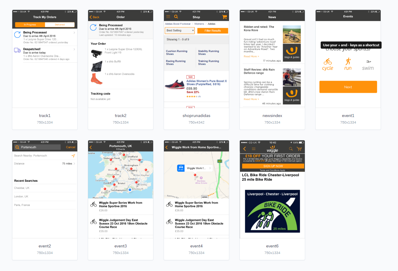
The iOS app includes:
- Ability to search the Wiggle product catalogue
- Straightforward access to purchase
- Persistent login (saved account details)
- Cross device functionality (i.e. iPhone and iPad)
- Ability to track orders
- Easy navigation to search and book Wiggle events across the UK
- Access to cycle guides
- Access to cycle insurance and legal services
- Simplified access to product reviews
In October 2015, Wiggle announced a sales increase of 26 per cent in the UK for the year ending February 2015. The firm also announced increased European sales, up 20 per cent, but a disappointing result in the rest of the world, down 13.1 per cent.
Events UX
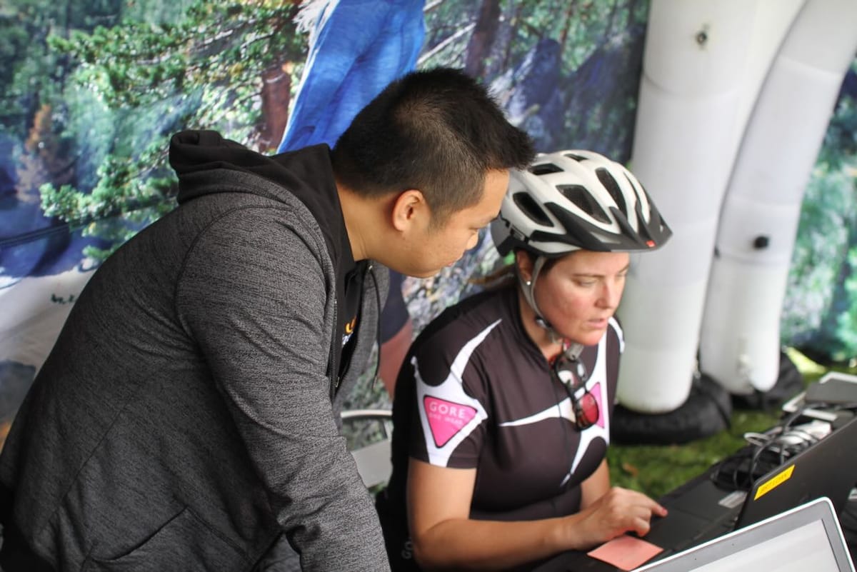
I was tasked with working on the user experience of Events on the iOS app. What would users want to interact with? How would we sell event tickets? How can we present our Events in a way that met user needs?
Discovery
While I had a list of requirements from the business, to ensure that users needs were met and adoption would be high, I had to discover the users experience and how the app could enrich their experience.
This is what users told me:
Running event user:
- Plenty of Portaloos — to know whether there are queues for them
- Set off times predicted on finish times — to avoid overtaking of slow runners
- UKA measured courses
- A medal
Cycling event user:
- Location (how far away form home — travel time) Will I need to stay over?
- Types of roads — quiet or busy
- Hilliness
- Likely weather
- Does it go on famous or iconic routes
- Support — food, mechanical
- Price
Condensing that down:
1. Weather is important
Users told us that one of the main considerations was weather. Users would sometimes “pay on the day” as they didn’t want to book an event well in advance and not know the likely weather. Weather then was a key consideration. What could we do to
2. Travel time is key
Knowing how far an event is was important to users. Some events, like the Wiggle Jurassic Beast Sportive is one of the top events that users flock to, so knowing how long it would take to drive there within the app would help them decide whether they needed to book a room in a hotel the night before or whether they could rock up on the day from home.
I also took some time out to read the reviews on the app store. Some users had left negative ratings, focusing on the app not feeling like a native experience and just doing what the website did. I took this as a steer to make something simple and that felt intuitive. Using the native Map app in iOS was one such decision — giving users something familiar and making best use of the platform they were on.
Applying what we learned
In terms of weather, there were two approaches. We could send a notification to users the day before their event notifying them of the likely weather. We could also show the weather in the app, when the event listing was closer to the event date.
Travel time could be solved pretty easily. With the business requirement stating that a map needed to be used, we could show the travel time by car for each event, based on the user’s current location.
Prototyping to validate requirements
At Wiggle, I’ve found wireframes to be pretty poor in terms of communicating ideas and proposed interactions. While I wireframe for my own understanding, I use Marvel to prototype the app before it gets developed.
Some business requirements were challenged based on what we now knew about our users. Being able to show the business this in a visual way was key in bringing them along the process and explaining why we had made the decisions we had.
Change of direction
Upon presenting the Marvel prototype to the product owner, it was decided that the flow should be changed:
- from show map with all events and then filter, to
- provide search criteria first, then show events that matched
Think of it from an Apple Maps UX to a Gumtree UX. There is no right answer, and seeing how users would follow this user journey would tell us whether it would need iterating again.
Wrapping up
First release of the Events feature was well received from users, with a 89% approval rating.


