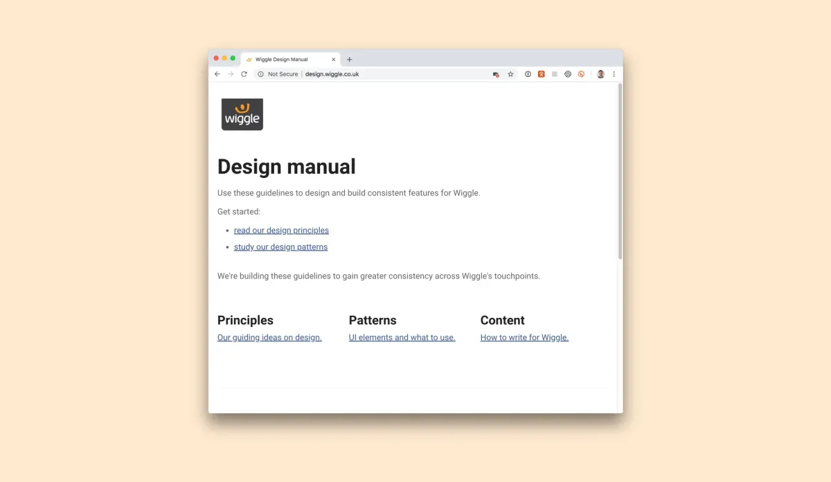
Building a design manual to bring consistency and clarity to Wiggle’s digital experience
How do you commit to consistency?

I’m a big fan of style guides when building experiences for users. It cuts down on time, it lets you focus on the important stuff and when you deliver, it fits nicely with the rest of the site.
But, not a lot of teams follow them.
The aim of the design manual is to capture the styles that we use, consolidate and work towards a long-term aim of consistency.
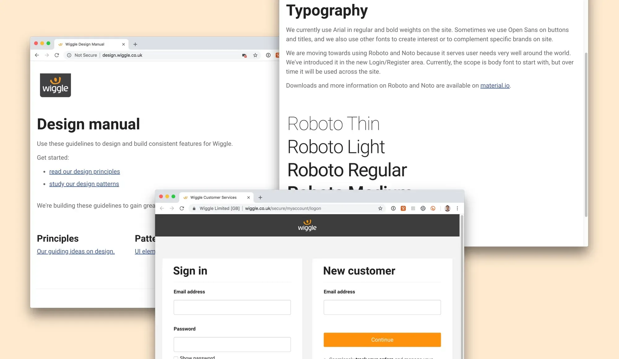
I put a prototype together using Bootstrap and started outlining the current styles first (to show the inconsistency) and then work with the team to evolve these into a set of consistent style guides.
Once the current styles were captured, we could start directing other design teams towards the resource.
We also needed to set some user experience requirements, especially on inclusive design. Penny captured some great usability requirements others had written that we could use to start with while we developed our own.
Content design and tone of voice was quite a big problem at Wiggle, so we drafted a set of standards and directed content writers to contribute to them.


